
Charts and its operations are some of the crucial aspects of MS Excel. It is very beneficial that you get acquainted with how to create various types of charts in Microsoft Excel and also know some of their basic operations because almost all fields of study make use of charts for one purpose or the other. This is the Part 2 of this tutorial. It explicitly explains charts and its operations and manipulations in all versions of Microsoft Excel. I will also provide some exercises to test your understanding.
It is advisable that you read the Part 1: DATABASE OPERATIONS IN MS-EXCEL (2016, 2013, 2010, 2007) before reading this part for deeper comprehension.

• To create a new chart sheet, press F11.
• The default Excel creates is a column chart.
• If Excel doesn’t plot your data the way that you want it to appear, you can change the axis on which Excel plots a data column.
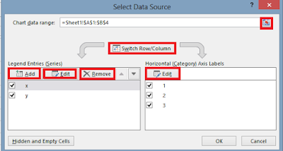
• To change which data Excel applies to the vertical axis and the horizontal axis, select the chart and then on the Design tab, in the Data group, click Select Data to open the Select Data Source dialogue box.
· 2-D COLUMN CHART
· 2-D LINE CHART
· 2D PIE CHART
· BASIC BAR CHART
· 2D AREA CHART
2. Click the worksheet to which you want to move the chart.
• Chart Elements gallery


It is advisable that you read the Part 1: DATABASE OPERATIONS IN MS-EXCEL (2016, 2013, 2010, 2007) before reading this part for deeper comprehension.

EXCEL CHARTS
A chart is a tool
you can use in MS-Excel to represent your worksheet graphically. A chart makes
data analysis interesting and easy. When you create a chart based on a work
sheet selection, MS-Excel uses the values from the worksheet and presents them
in a chart as data points which are represented by bars, lines, columns dots ,
etc. these shapes are referred to as DATA SERIES.
A chart is the best way to communicate trends in a large collection of
data because it summarizes data visually. In addition to the standard charts.
You have a great deal of control over your charts’ appearance—you can change
the color of any chart element, choose a different chart type to better
summarize the underlying data, and change the display properties of text and
numbers in a chart.
If the data in the worksheet used to create a chart represents a progression through time, such as sales over several months, you can have Excel extrapolate future sales and add a trend line to the graph that represents that prediction.
If the data in the worksheet used to create a chart represents a progression through time, such as sales over several months, you can have Excel extrapolate future sales and add a trend line to the graph that represents that prediction.
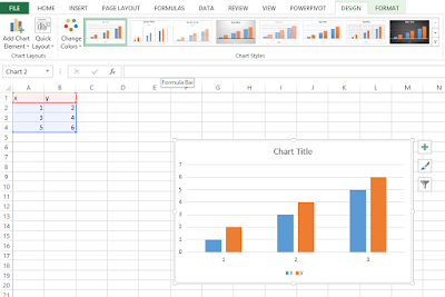
HOW TO CREATE A CHART
There are mainly two ways of creating charts in MS-Excel. They include:
SHORTCUT METHOD - USING THE QUICK ANALYSIS TOOL
The quick analysis tool is used to quickly and easily analyze your data
with some of Excel’s most useful tools such as charts, color-coding and
formulas. This tool saves some time and displays recommended charts to
summarize your data.
To create a char using this tool:
1. Select the entire data range you want
to chart including the column titles.
2. Click the Quick Analysis button and then click Charts as shown below to display the types of charts that Excel recommends.
2. Click the Quick Analysis button and then click Charts as shown below to display the types of charts that Excel recommends.
You can display a live preview of each recommended chart by pointing to
the icon that represents that chart. Clicking the icon adds the chart to your
worksheet.
GOING THROUGH THE INSERT TAB TO CREATE A CHART
This way becomes very useful If the chart you want to create doesn’t
appear in the Recommended Charts gallery.
To create a chart through the insert tab:
1. Select the data that you want to summarize visually.
2. Then, on the Insert tab, in the Charts group, click the type of chart that you want to create to have. Excel display the available chart sub types. When you point to a sub type, Excel displays a live preview of what the chart will look like if you click that sub type.
When you click a chart sub type, Excel creates the chart by using the default layout and color scheme defined in your workbook’s theme.
NOTES:
• To create a chart of the default type on the current worksheet, press Alt + F11.• To create a new chart sheet, press F11.
• The default Excel creates is a column chart.
• If Excel doesn’t plot your data the way that you want it to appear, you can change the axis on which Excel plots a data column.
• To change which data Excel applies to the vertical axis and the horizontal axis, select the chart and then on the Design tab, in the Data group, click Select Data to open the Select Data Source dialogue box.
To remove a column from an axis:
Select the column’s name, and then click Remove. To add the column to the Horizontal (Category) Axis Labels pane, click that pane’s Edit button to display the Axis Labels dialog box, which you can use to select a range of cells on a worksheet to provide values for an axis.
In the Axis
Labels dialog box, click the Collapse Dialog button at the right edge of the
Axis
Label Range
field, select the cells to provide the values for the horizontal axis (not
including the column
header, if any), click the Expand Dialog button, and then click OK. Click OK again to close the Select Data
Source dialog box and revise your chart.
TYPES OF CHARTS AND SHORTCUT KEYS TO CREATE THEM
COLUMN CHART
· 2-D COLUMN CHART
It illustrates
comparisons between Items. It also shows variation over a period of time.
· STACKED COLUMN CHART
It shows relationship of parts
to a whole
There are other types like: clustered column, 100% stacked column, 3-D
clustered column, 3-D stacked, 3-D 100% stacked column, 3D column charts.
SHORTCUT KEYS FOR COLUMN CHARTS
Hit the Alt key. Then type NCM (one key at a time).
LINE CHART
· 2-D LINE CHART
It emphasizes
time flow and rate of change rather than the amount of change. It also shows
trends or changes in data over a period of time at even intervals.
· HIGH-LOW-CLOSE
It is used to illustrate rate of
changes in stock prices.
There are other types like: line, stacked line, 100%stacked line, line
with markers, stacked line with markers, 100 % stacked line with markers, 3-D
line charts.
SHORTCUT KEYS FOR LINE CHARTS
Hit the Alt key. Then type NNM (one key at a time).
PIE CHART
· 2D PIE CHART
It uses only one data series. It
also shows relationship of parts to a whole.
There are other types like: 3-D pie, pie of pie, bar of pie and doughnut
(It is similar to pie chart but with more than one data series) charts.
SHORTCUT KEYS FOR PIE CHARTS
Hit the Alt key. Then type NQM (one key at a time).
BAR CHART
· BASIC BAR CHART
It illustrates
comparisons between items. It also shows individual figures at a specific time.
· STACKED BAR CHART
It shows the relationship of
parts to a whole.
SHORTCUT KEYS FOR BAR CHARTS
Hit the Alt key. Then type NBM (one key at a time).
AREA CHART
· 2D AREA CHART
It emphasizes amount of change
i.e. the magnitude of values. It also shows relative importance of values over
a period of time.
SHORTCUT KEYS FOR AREA CHARTS
Hit the Alt key. Then type NAM (one key at a time).
XY (SCATTER) CHART
It is normally used for
scientific data analysis. It shows the relationship for degree of relationship
between the numeric values in several chart data series. It plots two groups of
numbers as one series of a series of XY- coordinates.
SHORTCUT KEYS FOR XY (SCATTER) CHARTS
Hit the Alt key. Then type NDM (one key at a time).
RADAR CHART
It shows changes or frequencies of data series relative to a central
point and to one another. There are many types like: radar with markers and
filled radar.
SHORTCUT KEYS FOR RADAR CHARTS
Hit the Alt key. Then type NOM (one key at a time).
STOCK CHART
To create stock chart, arrange the data on tour sheet in this order:
high price, low price, closing price. Use dates or stock names as labels. There
are many types like: high-low-close, open-high-low-close, volume-high-low-close
and volume-open-high-low-close.
SHORTCUT KEYS FOR STOCK CHART
Hit the Alt key. Then type NOM
(one key at a time).
3-D SURFACE CHART
It is used in topographic maps. There are many types like: wireframe
3-D, contour and wireframe contour.
SHORTCUT KEYS FOR 3-D SURFACE CHART
Hit the Alt key. Then type NOM (one key at a time).
COMBO CHARTS
There are many types like: clustered column – line, clustered column –
line on secondary axis, stacked area – secondary column and clustered
combination.
SHORTCUT KEYS FOR COMBO CHARTS
Hit the Alt key. Then type NSDC (one key at a time).
HOW TO MOVE A CHART WITHIN A WORKSHEET OR TO A NEW WORKSHEET
To move a chart within a worksheet:
1. Drag the chart to the desired location.
2. If you want to move the chart to a new worksheet, click the chart and
then, on the Design tool tab, in the Location group, click Move Chart to open
the Move Chart dialogue box.
To move the chart to an existing worksheet:
1. Click Object In and then, in the Object In list.2. Click the worksheet to which you want to move the chart.
HOW TO CUSTOMIZE THE APPEARANCE OF YOUR CHARTS
After you have created your chart, you may want to customize and
beautify it so that it becomes attractive and unique. Excel has some galleries
that can help you achieve that easily.
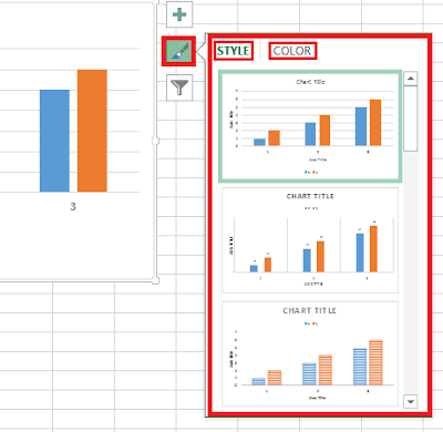
There are three main tools that you can use to customize your charts.
They include:
• Chart Elements gallery
• Chart Styles gallery
• Chart Filters gallery
Chart Elements gallery
The chart elements gallery allows you to add, remove or change chart elements such as title, label,
gridlines, data labels, etc. It becomes very useful especially if you don’t
find the exact chart layout you want, you can select the chart and then click
the Chart Elements action button, which appears to the right of the chart, to
control each element’s appearance and options.
Chart Styles gallery
The chart style gallery allows you to set style and colour scheme for your charts. It has two tabs: the style and the colour tab. You can select a new look for your chart by choosing from the many styles on the Style. Clicking the Color tab in the Chart Styles gallery displays a series of color schemes that you can select to change your chart’s appearance.
Chart Filters gallery
Allows you to edit data points and name that are visible on your chart. It also has two tabs: the values and the names tab.
PREDICTING YOUR CHART DATA TRENDS IN MS-EXCEL
Excel can help you predict your business trend make its best guess on how your business has performed in the past.
To utilize Excel capability to predict future values in your data series:
1. Click the chart (create one if you have not done so) and then click the Chart Elements action button.
2. Point to Trendline and then click the right-pointing triangle that appears, and then click More Options to display the Format Trendline pane. Excel asks you to add a Trendline based on series. Select the column you wish to find the trend and click OK.
3. On the Trendline Options page of the Format Trendline pane, you can choose the data distribution that Excel should expect when it makes its projection.
4. After you choose the distribution type, you can tell Excel how far ahead to project the data
trend.
NOTE:
It is advisable that you choose Linear because it applies to most business data. The other distributions are used for scientific and engineering applications and you will most likely know, or be told by a colleague, when to use them.
HOW TO SUMMARIZE YOUR DATA BY USING SPARKLINES
You can create charts in Excel workbooks to summarize your data visually by using legends, labels, and colors to highlight aspects of your data. It is possible to create very small charts to summarize your data in an overview worksheet, but you can also use Sparkline to create compact, informative charts that provide valuable context for your data.
In Excel, a Sparkline occupies a single cell, which makes it ideal for use in summary worksheets. As an example, suppose you wanted to summarize the monthly revenue data for one of Consolidated Messenger’s local branches. A sample data is shown below.
In Excel there are three types of Sparkline:
• Line Sparkline
• Column Sparkline
• Win/Loss Sparkline
The line and column Sparkline are compact versions of the standard line and column charts. The win/loss Sparkline indicates whether a cell value is positive (a win), negative (a loss), or zero (a tie).
To Create a Line Sparkline:
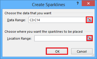
1. Select the data you want to summarize and then, on the Insert tab, in the Sparklines group, click the Line button.
2. Excel displays the Create Sparklines dialogue box as shown below.
3. The data range you selected appears in the Data Range box. If the data range is not correct, you can click the Collapse Dialog button to the right of the Data Range box, select the correct cells, and then click the Expand Dialog button.
4. Then, in the Location Range box, enter the address of the cell into which you want to place your Sparkline. When you click OK.
Excel creates a line Sparkline in the cell you specified as shown below.
You follow the same basic procedure to create a column Sparkline, except that instead of clicking the Line button in the Sparklines group on the Insert tab, you click the Column button.
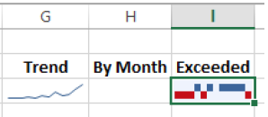
To create a win/loss Sparkline:
1. Ensure that your data contains, or could contain, both positive and negative values. If you measured monthly revenue for Consolidated Messenger, every value would be positive and the win/loss Sparkline would impart no meaningful information. Comparing revenue to revenue targets, however, could result in positive, negative, or tie values, which can be meaningfully summarized by using a win/loss Sparkline.
2. Follow the same data selection process and click the Win/Loss button as shown below.
Months in which Consolidated Messenger’s branch exceeded its revenue target appear in the top half of the cell in blue, months in which the branch fell short of its target appear in the bottom half of the cell in red, and the month in which the revenue was exactly the same as the target is blank.
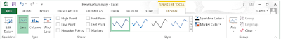
3. After you create a Sparkline, you can change its appearance. Because a Sparkline takes up the entire interior of a single cell, resizing that cell’s row or column resizes the Sparkline. You can also change a Sparkline’s formatting. When you click a Sparkline, Excel displays the Design tool tab as shown below.
NOTES:
• You can use the tools on the Design tool tab to select a new style; show or hide value markers; change the color of your Sparkline or the markers; edit the data used to create the Sparkline; modify the labels on the Sparkline’s axes; or group, ungroup, or clear Sparkline.
• You can’t delete a Sparkline by clicking its cell and then pressing the Delete or Backspace key—you must click the cell and then, on the Design tool tab, click the Clear button.
2. Joe-Links Computer Institute awards the following amount to each department as shown in the table below.
PRACTICE EXERCISES UNDER EXCEL CHART OPERATIONS
1. List and explain the real life or practical applications of any five type of charts you know.2. Joe-Links Computer Institute awards the following amount to each department as shown in the table below.

This is the end of part two of this tutorial.
Now move over to the Part 3 -MANIPULATIONSON SMARTART, DUAL-AXIS CHARTS, SHAPES AND MATHEMATICAL EQUATIONS IN MS-EXCEL
Recommended MS Excel Textbook
Get this book (Kindle format): Designing Professional Spreadsheet Management Systems Using Microsoft Excel 2013 and 2016.

Click Here to know more about the book.
Now move over to the Part 3 -MANIPULATIONSON SMARTART, DUAL-AXIS CHARTS, SHAPES AND MATHEMATICAL EQUATIONS IN MS-EXCEL
Get this book (Kindle format): Designing Professional Spreadsheet Management Systems Using Microsoft Excel 2013 and 2016.
Hope you learnt a lot from this
article? Comment below if you have any confusion. Don’t forget to share this
article with your friends. Also subscribe to get our latest posts.


 Apk + Obb Data File")
, Median & Mode in Excel")


No comments:
Post a Comment
WHAT'S ON YOUR MIND?
WE LOVE TO HEAR FROM YOU!