MS Access allows you to create and format mailing labels through the Label Wizard which reduces your typing stress and facilitates your work and also create
various types of chart and graphs through the charts wizard and include them in a report for easier data analysis.
You can also format your reports and mailing labels which are part of reports.
The most efficient way to build mailing labels is to create it using the Label
wizard in Microsoft Access. In this tutorial part, I will explicitly explain and
give you a step by step guide on how to create mailing labels and how to create
charts of different types especially in MS Access version 2010, 2013 2016 and
later versions which you may be finding difficult to create.
This is part 2 of chapter 7 of the Free Online Access Tutorial Series at Microsoft Tutorial website. In this part, I will explicitly explain how you can create a mailing label through the access label wizard and how to different kinds of charts for any version of MS Office Access you have on your pc.
In the previous part (Part 1), I explained how to design reports using different methods in MS Access in detail. Also see the full tutorial course content of this Microsoft Access Tutorial Series.
CREATING MAILING LABEL IN MS ACCESS
Mailing label is one of the special operations that can be
achieved using Microsoft Access. This operation is used to extract or retrieve
some information or fields that are needed in hard copy format from an existing
database table. It is mainly used by organization’s secretaries to lessen the
volume of characters to type when sending bulk SMS and also saves the user or
the secretary the troubles of retyping the information. The Labels feature or icon is located in
the Reports group in Microsoft
Access Create tab and is very
similar to Reports but with minor
difference as you will see shortly.
For example, assuming you are the secretary, the Manager of
your company may tell you to send a memo for a meeting to all the staff in the
company, instead of starting afresh to type the name and address of all the
staff, you can use the mailing label in MS Access to extract the needed
information from a database already containing workers bio data like the workers payroll system table, etc.
To Create a Mailing Label in MS Access:
1. First highlight the
table or query you wish to use as the data source for the label from the Navigation pane. Referring to the above
example, I will select the workers
payroll system table.
2. Click Labels located in the Reports group under the Create tab. This prompts the report
wizard dialogue box.
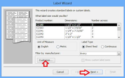
3. Specify the orientation of the label by choosing a suiting
dimension for your label as shown below. The default setting is ok for use but
you can also create a customized dimension for your label by clicking the Customize tab. Click Next.
4. Specify the font type, font style, font size, font weight,
text colour, etc. (the default selections are ok). Then click Next.
5. Select the fields needed in the mailing label. For example,
first name, etc. use the > button
to transfer the selected fields from the
available fields: box to the prototype
label: and then click Next.
6. Specify the sorting field for the mailing label and again
use the > button to transfer it
to the Sort by: box and then click Next.
7. Lastly, type a unique name for your mailing label, specify
whether to see how the labels will look when printed or to further modify your
label in the design view and click Finish.
HOW TO CREATE A CHART OR GRAPH FOR YOUR DATASHEET DATA OR INFORMATION
A chart or graph is a graphical representation of information. Charts
are normally used to summarize the relationship among data and to summarize all
financial analysis. Some professionals like Data Analysts and Managers prefer
graphical representation of data using chart to tabular representation for a
more efficient comparison of information.
For example, you might want to chart the data from your
sales report table, workers’ payroll system table, etc. You can create a chart
and include it in your reports using data from a previously created table or
query as your data source.
There has been a rumor that charts are no longer supported
in MS Access 2013 and later versions, and that you have to first create it
Excel or export your data to Excel. No you can still create your charts
directly in MS Access 2013 and later versions but with limited features. If you
want a more control to your charts, then
create it in MS Excel, a perfect application for creating charts
To Create a Chart for your Data in MS Access 2013 and later Versions:
1. Click the Blank
Report located in the Reports group
under the Create tab.
3. Click in the Design area of your report and drag your mouse
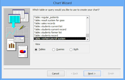
to define the width and height of your chart. This prompts the Chart Wizard dialogue box. Choose the
data source table or query name and click Next
as shown below.
4. Choose the fields that hold the data needed for the chart.
Use the > button to transfer the
selected fields to the Fields for Charts
box and click Next.
6. MS Access now displays the preview of your chart. If you
don’t like the chart preview, click the Back
button and change your specifications. If you like the preview, click Next.
7. Next, type in your chart title and specify whether to
include the legend for your chart or not. Then click Finish.
8. MS Access now displays your chart in the specified area. To
edit your chart data sheet, right click anywhere inside the chart and select Datasheet to call up the Datasheet form. Then from there, you
can completely edit your chart data to your taste. You can also change the
legend label from there as shown below.
9. Save your chart with a unique file name. You can also print
it out if you wish by pressing Ctrl +
P on your keyboard.
NOTE:
You can also create chart easily in MS Excel. Go to chapter 2 of the Excel tutorial to
see how to create easily chart in Microsoft Excel.
This is the end of part 2 of chapter 7 of this FREE online MS Access tutorial training series.
In the next part (part 3), I will give you the step by step guide on how to print, preview and export a report in MS Access.
Recommended MS Access Textbook
Get this book (Kindle format): Designing Professional Database Management Systems Using Microsoft Access 2013 and 2016 and MySQL.
Click Here to know more about the book.In the next part (part 3), I will give you the step by step guide on how to print, preview and export a report in MS Access.
Was this tutorial helpful to you?
Inform your friends about this post by clicking the share button below. Comment below if you are hooked up along the installation process.
Also click Here to subscribe for free so that you will get our latest game updates in your email.


No comments:
Post a Comment
WHAT'S ON YOUR MIND?
WE LOVE TO HEAR FROM YOU!