
Other important aspect of MS Excel are SmartArt, Dual -axis charts and mathematical equations. SmartArts add a lot of flavour to the look of your worksheet or spreadsheet designs. This is the Part three and last Part of chapter 2 of this tutorial series. In this, part, I will focus and explain explicitly, manipulations of SmartArt components, Plotting two graph charts in a single pair of axis, inserting and manipulating shapes and mathematical equations in your Excel worksheet, etc.

It is advisable that you read Part 1 and Part 2 of this tutorial so that you can flow with me.

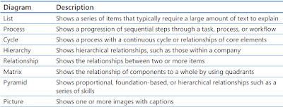
The table in the figure below lists the types of diagrams you can create by using the Choose A SmartArt Graphic dialog box.


This is the end of this tutorial part.
Now move over to the Chapter 3: Practical and Business Applications of Built-in functions in MS Excel.

It is advisable that you read Part 1 and Part 2 of this tutorial so that you can flow with me.
HOW TO USE SMARTART TO CREATE DIAGRAMS IN EXCEL
Many times, as a Chief Operating Officer of a company, you will need to summarize the company’s processes for the Board of Directors by creating diagrams. Excel has just the tool you needs to create those diagrams: SmartArt.
To create a SmartArt graphic:
1. Click SmartArt on the Insert tab, in the Illustrations group to display the Choose A SmartArt Graphic dialog box as shown below.

2. When you click one of the thumbnails in the center pane of the Choose A SmartArt Graphic dialog box, Excel displays a description of the diagram type you selected in the rightmost pane of the dialog box. Clicking All displays every available SmartArt graphic type.
The table in the figure below lists the types of diagrams you can create by using the Choose A SmartArt Graphic dialog box.

NOTE:
Some of the diagram types can be used to illustrate several types of relationships. Be sure to examine all your options before you decide on the type of diagram to use to illustrate your point.
3. After you click the button that represents the type of diagram you want to create, click OK to add the diagram to your worksheet.

4. While the diagram is selected, Excel displays the Design and Format tool tabs. You can use the tools on the Design tool tab to change the graphic’s layout, style, or color scheme. The Design tool tab also contains the Create Graphic group, which is home to tools you can use to add a shape to the SmartArt graphic, add text to the graphic, and promote or demote shapes within the graphic.
As an example, consider a process diagram that describes how Consolidated Messenger handles a package within one of the company’s regional distribution centers.

In the text pane, located to the left of the SmartArt graphic, you can add text to a shape without having to click and type within the shape. If you enter the process steps in the wrong order, you can move a shape by right-clicking the shape you want to move and then clicking Cut on the shortcut menu that appears.
5. To paste the shape back into the graphic, right-click the shape to the left of where you want the pasted shape to appear, and then click Paste.
For example, if you have a five-step process and accidentally switch the second and third steps, you can move the third step to the second position by right-clicking the third step, clicking Cut, right-clicking the first shape, and then clicking Paste.
For example, if you have a five-step process and accidentally switch the second and third steps, you can move the third step to the second position by right-clicking the third step, clicking Cut, right-clicking the first shape, and then clicking Paste.
6. If you want to add a shape to a SmartArt graphic, to add a step to a process, for instance, click a shape next to the position you want the new shape to occupy and then, on the Design tool tab, in the Create Graphic group, click Add Shape, and then click the option that represents where you want the new shape to appear in relation to the selected shape.
NOTE:
The options that appear when you click Add Shape depend on the type of SmartArt graphic you created and which graphic element is selected. For instance, the options for an organizational chart are Add Shape After, Add Shape Before, Add Shape Above, Add Shape Below, and Add Assistant.
7. You can edit the graphic’s elements by using the buttons on the Format tool tab or by right-clicking the shape and then clicking Format Shape to display the Format Shape pane. If you have selected the text in a shape, you can use the tools in the Font group on the Home tab to change the text’s appearance.
NOTE:
You can use the controls in the Format Shape dialog box to change the shape’s fill color, borders, shadow, three-dimensional appearance, and text box properties.
Shortcut Key of Creating Diagrams Using SmartArt
• Hit the Alt key. Then type NM (one key at a time).
HOW TO CREATE DUAL-AXIS CHARTS IN MS-EXCEL
MS-Excel charting engine provides you with the flexibility to plot more than one data series, even if the series use two different scales. For example, you might to plot an XY scatter charts graph of Engineering Stress versus Engineering Strain and True Stress versus and True Strain in the same axes. The table is shown in the diagram below.

To Plot Two Graph Charts in the Same Axis in MS-Excel:
1. Ensure that you have prepared the data table. Highlight the entire table and click on Insert tab and click on Recommended Charts in the Charts group. The Insert Charts dialogue box displays.
2. Click the All Charts tab. Then from the charts category available, click on XY (Scatter).
3. From the sub category, select Scatter with Smooth Lines and Markers.
4. Select the second option and click OK as shown below.

Excel inserts the chart as shown below.

HOW TO CREATE SHAPES AND MATHEMATICAL EQUATIONS IN MS-EXCEL
With Excel, you can also augment your worksheets by adding objects such as geometric shapes, lines, flowchart symbols, and banners.
To add a shape to your worksheet:
1. Click the Insert tab and then, in the Illustrations group, click the Shapes button to display the shapes available.
2. When you click a shape in the gallery, the pointer changes from a white arrow to a thin black crosshair. To draw your shape, click anywhere in the worksheet and drag the pointer until your shape is the size you want.
3. When you release the mouse button, your shape appears and Excel displays the Format tool tab as shown below.

NOTE:
Holding down the Shift key while you draw a shape keeps the shape’s proportions constant. For example, clicking the Rectangle tool and then holding down the Shift key while you draw the shape causes you to draw a square.
4. You can resize a shape by clicking the shape and then dragging one of the resizing handles around the edge of the shape. You can drag a handle on a side of the shape to drag that side to a new position; when you drag a handle on the corner of the shape, you affect height and width simultaneously. If you hold down the Shift key while you drag a shape’s corner, Excel keeps the shape’s height and width in proportion.
5. To rotate a shape, select the shape and then drag the white rotation handle at the top of the selection outline in a circle until the shape is in the orientation you want.
NOTE:
You can assign your shape a specific height and width by clicking the shape and then, on the Format tool tab, in the Size group, entering the values you want in the height and width boxes.
6. After you create a shape, you can use the controls on the Format tool tab to change its formatting.
7. To apply a predefined style, click the More button in the lower-right corner of the Shape Styles group’s gallery and then click the style you want to apply.
8. If none of the predefined styles are exactly what you want, you can use the Shape Fill, Shape Outline, and Shape Effects options to change those aspects of the shape’s appearance.
NOTE:
When you point to a formatting option, such as a style or option displayed in the Shape Fill, Shape Outline, or Shape Effects lists, Excel displays a live preview of how your shape would appear if you applied that formatting option.
You can preview as many options as you like before committing to a change. If a live preview doesn’t appear, click the File tab to display the Backstage view and then click Options to open the Excel Options dialog box. On the General page, check the Enable Live Preview check box and click OK.
9. If you want to use a shape as a label or header in a worksheet, you can add text to the shape’s interior. To do so, select the shape and begin typing; when you’re done adding text, click outside the shape to deselect it. You can edit a shape’s text by moving the pointer over the text.
10. When the pointer is in position for you to edit the text, it will change from a white pointer with a four-pointed arrow to a black I-bar. You can then click the text to start editing it. If you want to change the text’s appearance, you can use the commands on the Home tab or on the Mini Toolbar that appears when you select the text as shown below.

HOW TO ADD MATHEMATICAL EQUATIONS TO A SHAPE IN EXCEL
One other way to work with shapes in Excel is to add mathematical equations to their interior. As an example, a business analyst might evaluate Consolidated Messenger’s financial performance by using a ratio that can be expressed with an equation.
To add an equation to a shape:
1. Click the shape and then, on the Insert tab, in the Symbols group, click Equation, and then click the Design tool tab to display the interface for editing equations as shown below.

Clicking the Equation arrow displays a list of common equations, such as the Pythagorean Theorem, that you can add with a single click.
2. Click any of the controls in the Structures group to begin creating an equation of that type. You can fill in the details of a structure by adding text normally or by adding symbols from the gallery in the Symbols group.
In Summary:
• You can use charts to summarize large sets of data in an easy-to-follow visual format.
• You’re not stuck with the chart you create; if you want to change it, you can.
• If you format many of your charts the same way, creating a chart template can save you a lot of work in the future.
• Adding chart labels and a legend makes your chart much easier to follow.
• When you format your data properly, you can create dual-axis charts, which are compact and easy to read.
• If your chart data represents a series of events over time (such as monthly or yearly sales), you can use Trendline analysis to extrapolate future events based on the past data.
• With Sparkline, you can summarize your data in a compact space, providing valuable context for values in your worksheets.
• With Excel, you can quickly create and modify common business and organizational diagrams, such as organization charts and process diagrams.
• You can create and modify shapes to enhance your workbook’s visual impact.
• The improved equation editing capabilities help Excel 2013 users communicate their thinking to their colleagues.
This is the end of this tutorial part.
Recommended MS Excel Textbook
Get this book (Kindle format): Designing Professional Spreadsheet Management Systems Using Microsoft Excel 2013 and 2016.

Click Here to know more about the book.
Now move over to the Chapter 3: Practical and Business Applications of Built-in functions in MS Excel.
Get this book (Kindle format): Designing Professional Spreadsheet Management Systems Using Microsoft Excel 2013 and 2016.
Hope you learnt a lot from this
article? Comment below if you have any confusion. Don’t forget to share this
article with your friends. Also subscribe to get our latest posts.


 Apk + Obb Data File")
, Median & Mode in Excel")


No comments:
Post a Comment
WHAT'S ON YOUR MIND?
WE LOVE TO HEAR FROM YOU!